
mcvitie's Case study
package redesign — U.K. to U.S. market
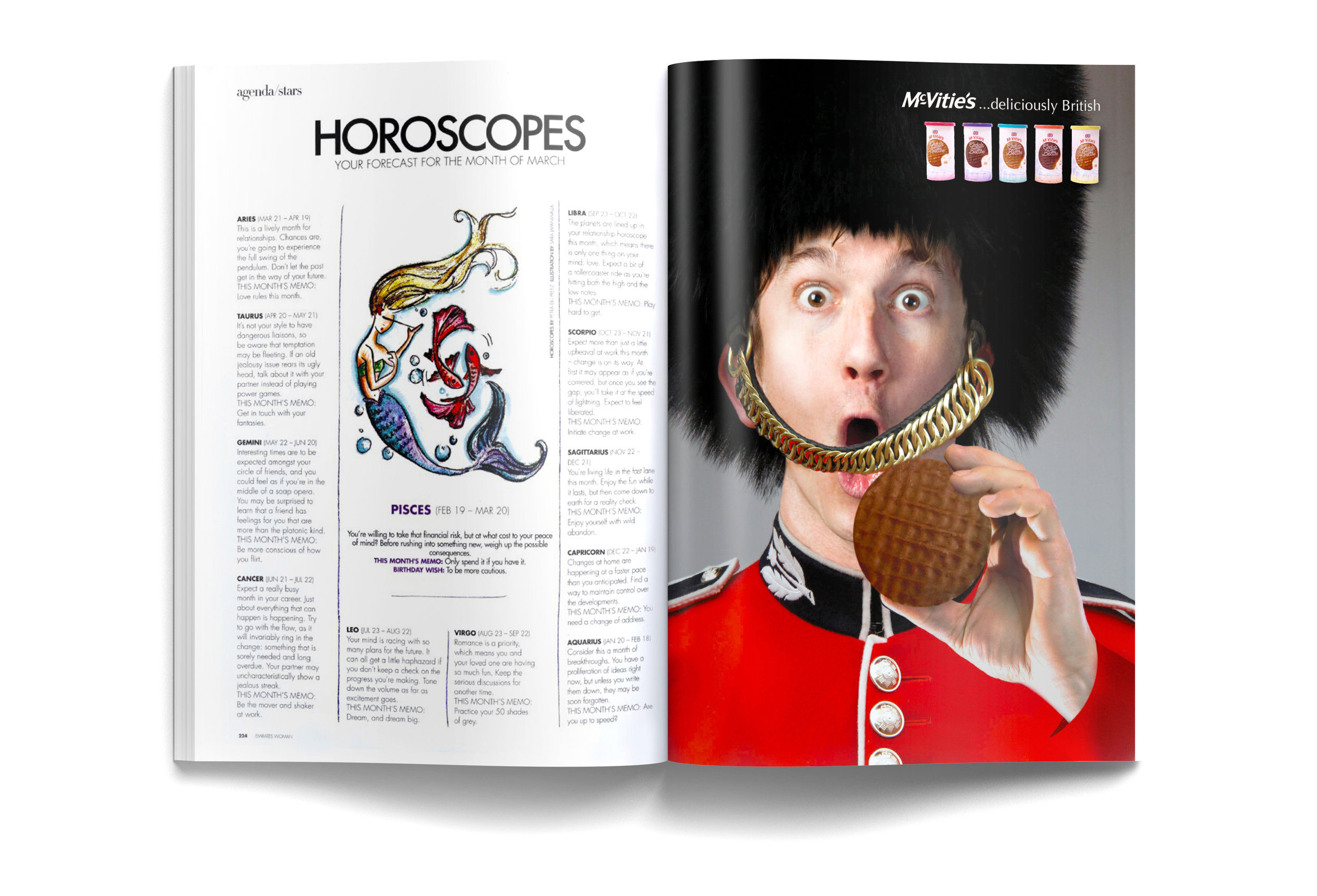
McVitie's Biscuits are a staple in British households. The average Brit consumes about two a day along with their ritual cup of tea. I wanted to redesign my favorite childhood treat with the American consumer in mind. The target audience is women ages sixteen to sixty. I wanted to keep the international feel by integrating a watercolor painting of Big Ben and a Union Jack flag an element in the logo. My goal when redesigning the packaging line was to look more appealing which is especially important because they may not be able to rely on their brand recognition in the USA.
Original package / redesign comparison


Magazine Advertisement


sketches


